The Art of Visual Branding: Examining My Record Collection From A Marketing Perspective
By Kyla Lemieux
For many decades, vinyl records have been known as a primary method of listening to music. But as technology has advanced, they’ve become much more than a simple black disc with your favourite album on it. When vinyl began making its major worldwide comeback in the late 2000s, artists saw them as a fresh way of promoting their brand, as well as their music.
Personally, I have been collecting records since 2018, and the more I collect, the more I realize just how important marketing and branding are to an artist and their public persona. When an artist designs a record that in some way matches the comprehensive vibe of their album, interest in the product instantly builds to a whole new level and makes the purchase of a vinyl record an entire experience. Listed below are my top 10 favourite records in my personal collection, observed from a marketing standpoint.
10: Tate McRae – So Close To What – Purple and Gold Swirl “Mardi Gras” Vinyl
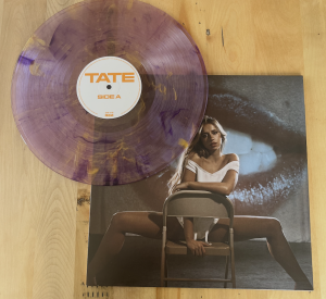
Ever since Tate McRae first rose to fame in 2020 with her hit single “You Broke Me First,” her personal branding and aesthetics have been one of the centerpieces of her stage presence. With the release of her third studio album, So Close To What, she carried those specific branding details into her vinyl records. While the album came out with different vinyl variants, this colourful, translucent “Mardi Gras” variant is the star of the show.
On its own, it’s already a unique vinyl, but the significance the pressing has to the album itself is something that I noticed as soon as I opened the record for the first time. The purple marbling of the record almost gives the effect of a netting material, perfectly playing into the album’s fifth track, “Purple Lace Bra.” Records like this, which contain aspects tying the vinyl pressing back to the album held within its grooves, show what a difference branding can make when it comes to the products artists sell.
9: Olivia Rodrigo – Guts (Spilled) – Red and Purple Splatter Vinyl
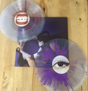
Whether you’re a fan or not, just about everyone thinks of the colour purple when they think of Olivia Rodrigo. With her debut album, Sour, she established her aesthetic brand, with purple covering every aspect of her career from her album cover to the colour you were met with when you searched her website. After the release of her second album, Guts, fans were sure that she’d never stray from her purple roots. However, it is impossible for Rodrigo fans to escape the colour as even the lighting at her Guts World Tour painted the stage and audience purple.
Rodrigo wasn’t set on being the “purple popstar” forever. When she announced the deluxe edition of her sophomore album, Guts (Spilled), fans noticed a slight difference immediately: the now-iconic purple bra she’s seen wearing on the original Guts cover had been changed to red on the cover of the deluxe album. The accompanying vinyl identified her official departure from her illustrious purple era. While one of the LPs in the record still contains a gorgeous purple splatter design, the other is bright red. And of course, the colour red is entirely intentional. Red is widely known as the colour of love, and the deluxe tracks included on the album are Rodrigo’s first songs to contain themes of being in-love. Since this release, Rodrigo has once again re-branded to a light shade of pink, proving that the Guts (Spilled) vinyl was a true turning point in her visual career.
8: Taylor Swift – The Life of a Showgirl – “Sweat and Vanilla Perfume” Portofino Orange Glitter Vinyl
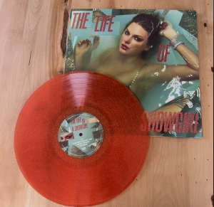
One of the countless things Taylor Swift is famous for is the reliable aesthetic re-branding each time she releases a new album. Her primary way of doing so is through the use of colour. Almost every common colour has been temporarily claimed by Swift for the purpose of one of her album releases. In 2025, the release of her 12th album, The Life of a Showgirl, officially marked her entry into her orange era. Though, in true Taylor Swift fashion, she released over 10 vinyl variants for the album, the standard pressing of the album was a beautiful glittery orange pressing, perfectly capturing the essence of the album. Each of her albums to date (with the exception of her debut self-titled album, which has yet to be re-released on coloured variants) have a pressing in the signature colour of the album, and The Life of a Showgirl is no exception. The orange colour proves that Swift always puts branding at the forefront, while the glittery consistency of the vinyl accurately depicts the overall tone of the album.
7: Wicked: For Good Soundtrack – Amazon Exclusive Pink/Blue and Green Splatter Vinyl
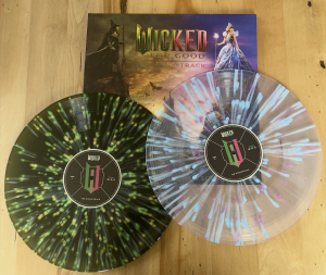
The release of the highly-anticipated Wicked musical-movie proved that the artistic team in charge of product management was not playing around with the physical copies of the soundtrack. The film’s squeal, Wicked: For Good, was no different. With roughly 10 variants of the album, we saw that each pressing contained some aesthetic significance to the film, but this Amazon Exclusive pressing turned out to be my personal favourite variant. One of the two LPs has a deep, earthy green, slightly translucent foundation, with two brighter shades of green acting as highlights, splattered across the record. LP 2 has an entirely clear base, but the contrasting bright blue and pink splatters make the vinyl anything but simple. Of course, the green of LP one is meant to represent Elphaba, as well as the darkness that her character faces throughout the film. The pink and blue on the second LP perfectly match the colours of Glinda’s gown, which she wears throughout the majority of the film, as well as on the album’s cover.
6: Lyric – The Art of Falling First – Pink Splatter Vinyl
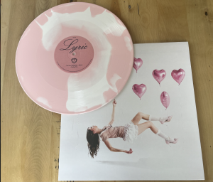
The limited edition variant for this EP is proof that you don’t have to be a major artist to create quality products, or to have a unique visual brand. Though the Australian musician, Lyric, is still considered a relatively underground artist, this never stopped her from producing merchandise that catches your eye. Similar to the previously mentioned Guts (Spilled) album by Olivia Rodrigo, The Art of Falling First was one of Lyric’s first forays into songs about being in-love, and this splatter vinyl pressing captures that impeccably. The primary light pink colour paired with the clean white of the vinyl feel just as fresh and exciting as falling in love. The uniqueness of the splatter pattern seem to be a representation of the individuality of each person’s experience with love. Focusing on branding early in one’s career -the way Lyric has- is one of the most important ways of ensuring that your career will gain momentum, since visuals are a primary way of gaining attention.
5: Death Becomes Her: New Broadway Cast Soundtrack – Purple Splatter Vinyl
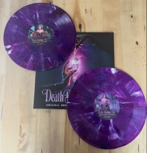
As someone who purchases soundtracks quite rarely compared to the amount I purchase regular albums, I always get especially excited when I come across a one-of-a-kind pressing of a soundtrack I enjoy. Out of all the soundtracks in my collection, the one for the new Broadway cast recording of Death Becomes Her is my favourite by far. Before focusing on the significance of the vinyl within the musical’s story, I must mention the overall beauty of this pressing. The deep purple colour can best be described as incredibly satisfying, and the highlights of white or lighter purple make it much more engaging than just a standard purple vinyl. Of course, the reasoning behind the colour for this soundtrack goes much deeper than just a pretty colour. Anyone who has seen either the film or stage version of Death Becomes Her knows that the iconic purple potion is a fundamental part of the story. The way the marbled designs sprawl across the vinyl gives the haunting effect of the potion itself, as if it’s been spilled on the record. As I’ve mentioned before in this article, I absolutely love when a vinyl has some sort of tie-in with something included on the album’s cover or contents, so this is a definite highlight within my collection.
4: Ashe – Rae – Grape and Wine Splatter Vinyl
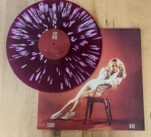
When I first opened this record, I remember audibly gasping. Though I’d already gotten many splatter records in the past, I had never seen one this stunning, and I still have yet to find one since that gives me the same reaction upon unboxing. While the vinyl definitely matches the vibes of the album, the main attraction for me is the way the colours work together to create something completely gorgeous. The backdrop of the record is a deep, pinkish-purple colour, which turns bright when held up to the light. On top of this colour, a shade of magenta is splattered across the record in a spotted pattern. On the end of each spot is a very light pink tail, giving the effect of pink comets. As a whole, splatter pressings have always been a preference of mine, but Rae by Ashe is definitely the one I am most drawn to.
3: Charli XCX – Brat And It’s Completely Different But Also Still Brat – Translucent “Brat Green” Vinyl
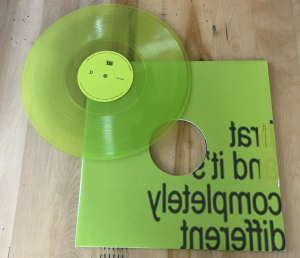
To anybody with any form of pop-culture awareness, it is absolutely undeniable that Charli XCX took over the summer of 2024 with her album, Brat. Of course, none of this would have been possible without the unprecedentedly bold shade of neon green that accompanied every aspect of the album’s promotion. Though many didn’t understand the bare-minimum design of the album cover paired with the now-iconic colour, it can’t be argued that “Brat Green” is the entire foundation of the album and the worldwide phenomenon of “Brat Summer.”
In October of 2024, Charli XCX released a remix version of Brat featuring a different artist on each of the album’s tracks. With this new release, Charli finally produced a vinyl variant in the exact, unescapable colour of the album cover. Ever since the album’s initial release, fans had been predicting that the deluxe version of the album would come in this shade, and this double LP vinyl brought exactly that. While the vinyl itself is a simple, single-colour translucent pressing, it still ranks very high in my list due to its immaculate branding in relation to the album. The release of Brat proved that Charli is quite the marketing genius, and this specific pressing is a perfect example of how important it is to tie products and music together with one trademark vibe.
2: Ella Red – It’s Not Real – Black Ice and Pink Pinwheel Vertigo Exclusive Vinyl
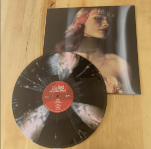
As soon as I saw this record on the Vertigo Vinyl website, I knew it was one I needed to add to my collection. The rise of pinwheel vinyl pressings has been very present as of late, and this is one of my favourites that I’ve seen so far in that style. As a relatively small artist, Ella Red is another great example of how it’s just as important for small artists to build their brand as it is for extremely well-known musicians. Personally, I can’t think of a better way that It’s Not Real could’ve been visually represented. Upon first listen, this album can be put into a darker, almost gothic category, as it is filled with somber topics. But once you get to know the album better, you see little bits of Red’s true, bubbly personality coming through. It is known throughout that her sonic and visual styles are quite different, but the more you listen to It’s Not Real, the more you understand that it is so much more than a melancholy, pensive piece of work. The vinyl itself is a perfect representation of just that. While the record’s base is ice black, the soft, baby pink pinwheel aspect of the vinyl holds the same complimentary contrast as the themes within the album.
1: Suki Waterhouse – Memoir of a Sparklemuffin – “Sparklemuffin Pearl” Vinyl
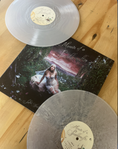
Though the list I’ve curated is filled with nine other unique vinyl pressings, Memoir of a Sparklemuffin took the top spot, due to the perfect balance it holds between aesthetics and branding. On first glance, this vinyl is already very eye-catching; the shiny silver variant is pressed in the relatively rare cloudy style that is just beginning to gain popularity within the world of records. The colour also matches the glittery aesthetics of the album, as well as the gown that Waterhouse is wearing on the cover. But if you look even deeper into the significance of the record, you see that the pressing is the perfect representation of the album’s title. A fact that many were unaware of before the release of the album is that a sparklemuffin is a type of spider, and the nearly transparent cloudy effect of the vinyl looks similar to the web made by a spider. When I noticed this detail, I was incredibly impressed, as it takes a truly great artistic team to think to add unique visual components like this to a vinyl.
Reflecting on my collection in this way made me truly realize the power that branding has over a project, and over an artist as a whole. Creating a memorable product is an art in itself, and chances are if an artist creates merchandise, such as vinyl records, that contain a little bit of their own creative character, it will make them all the more unforgettable in the long run.

You May Also Like
How Charli XCX’s New Film The Moment Lives Up to Its Name
2026 Grammy Predictions